Manukora Honey Rebrand
Business Challenge
Manukora is an ultra-premium Manuka honey brand, but its visual identity did not reflect the quality or provenance of the product. The brand lacked a cohesive system across packaging and marketing channels, making it difficult to stand out in a competitive premium honey category.
Strategic Approach
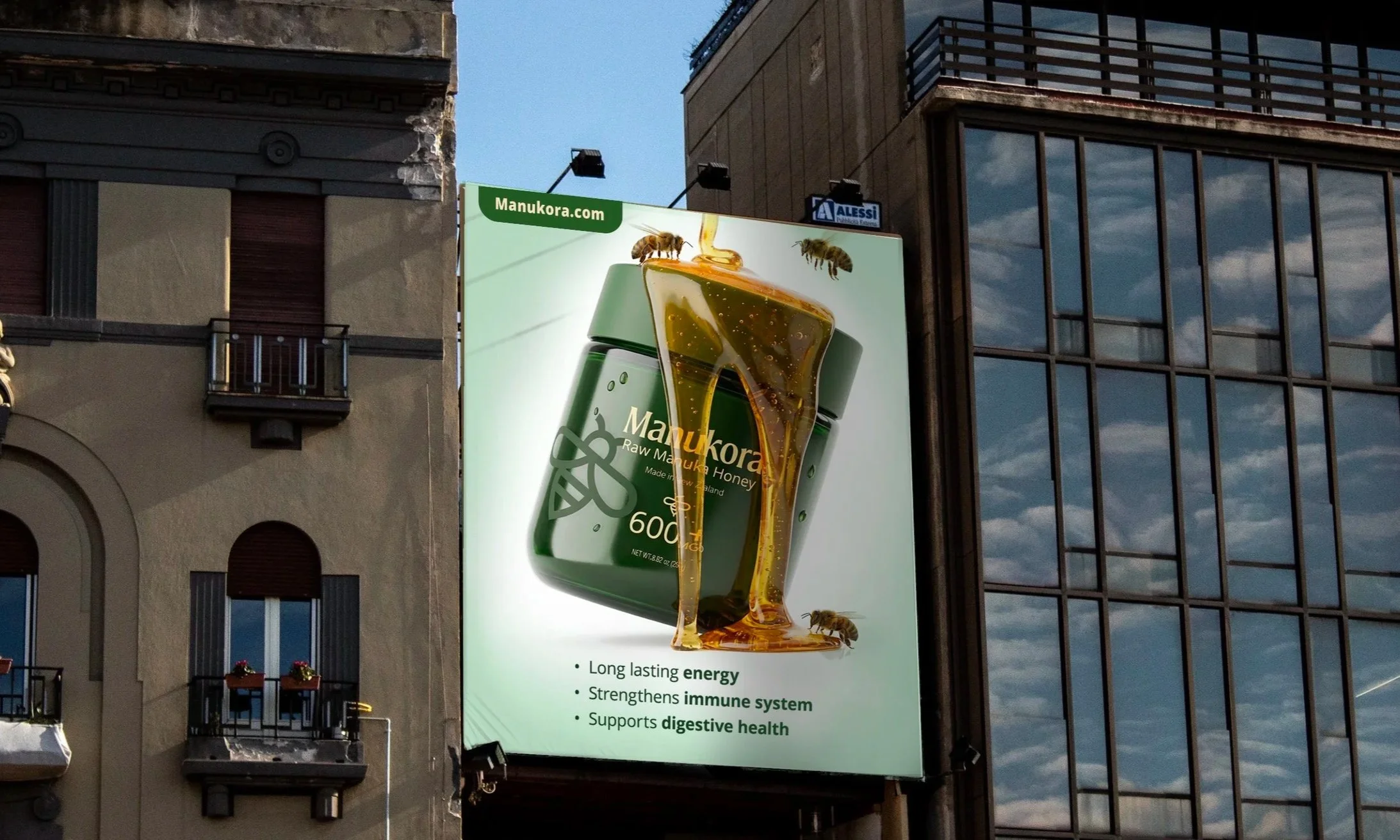
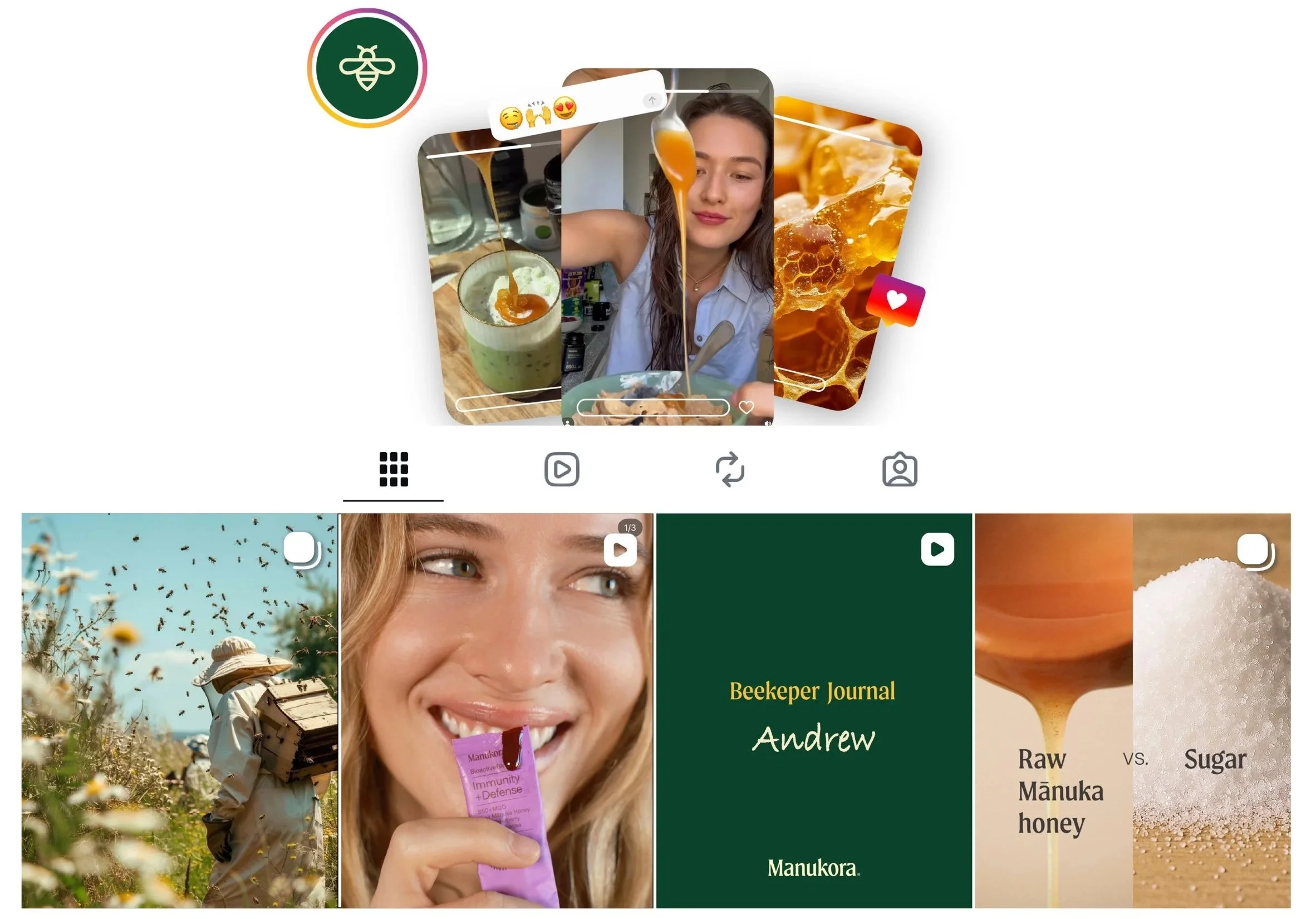
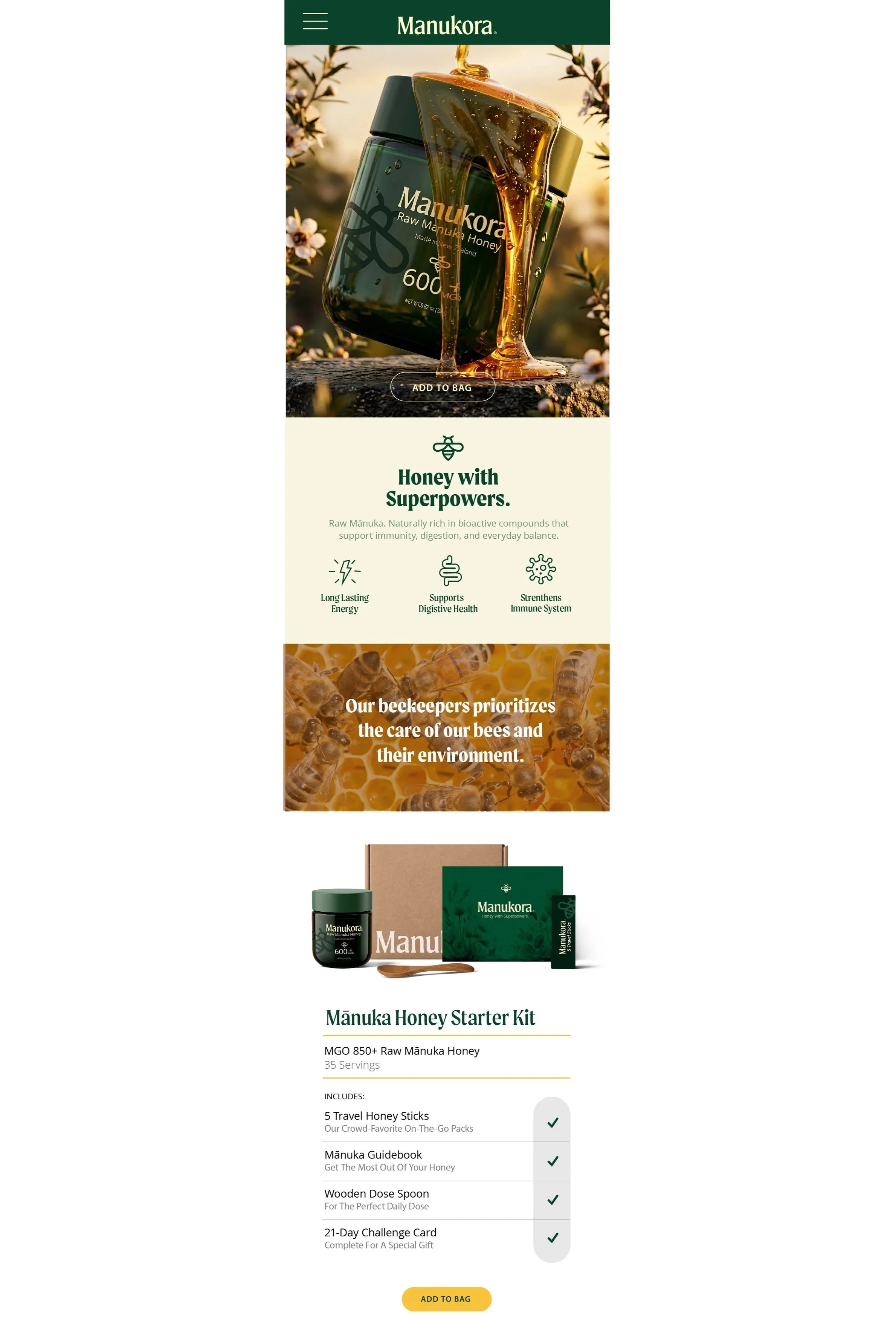
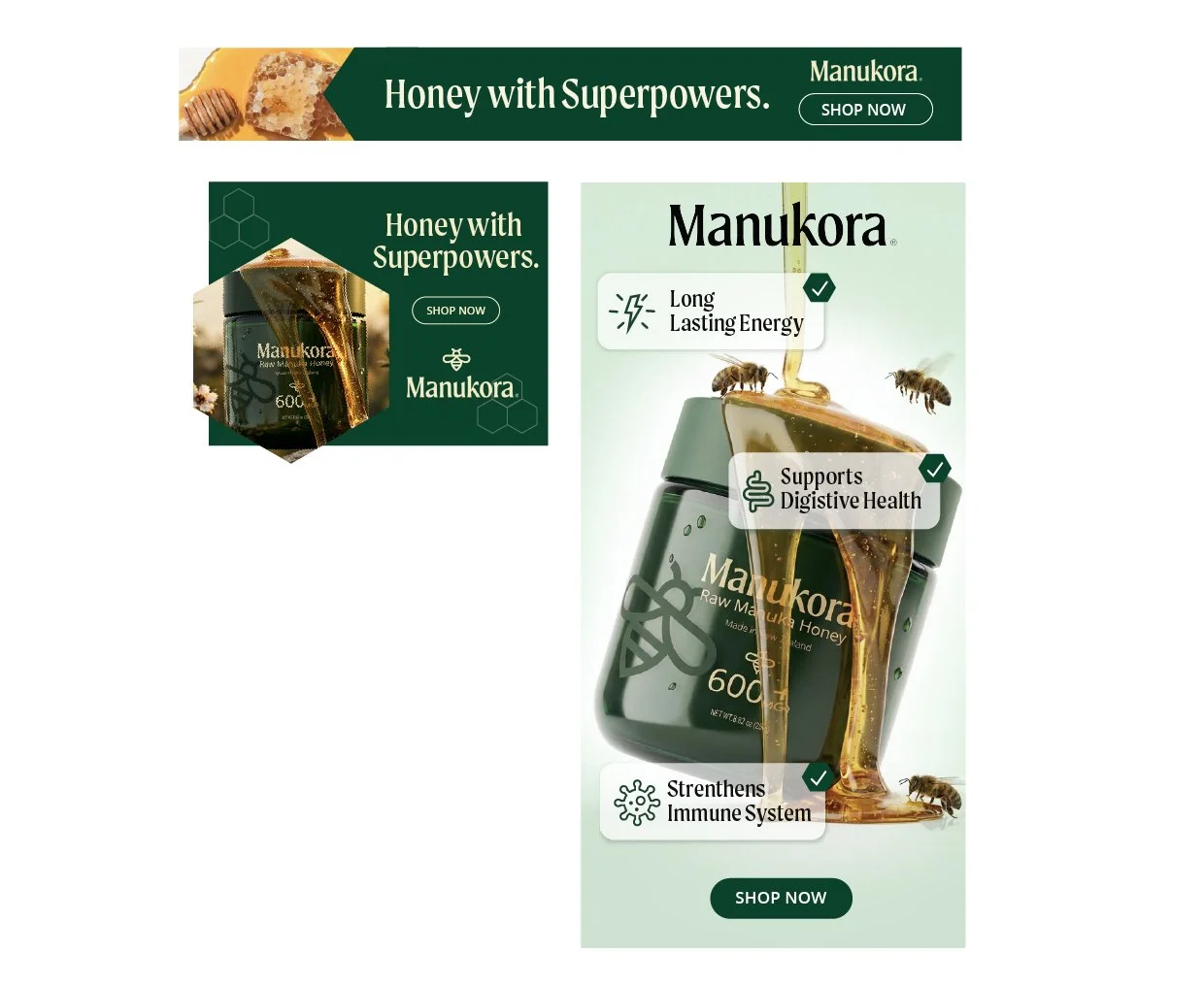
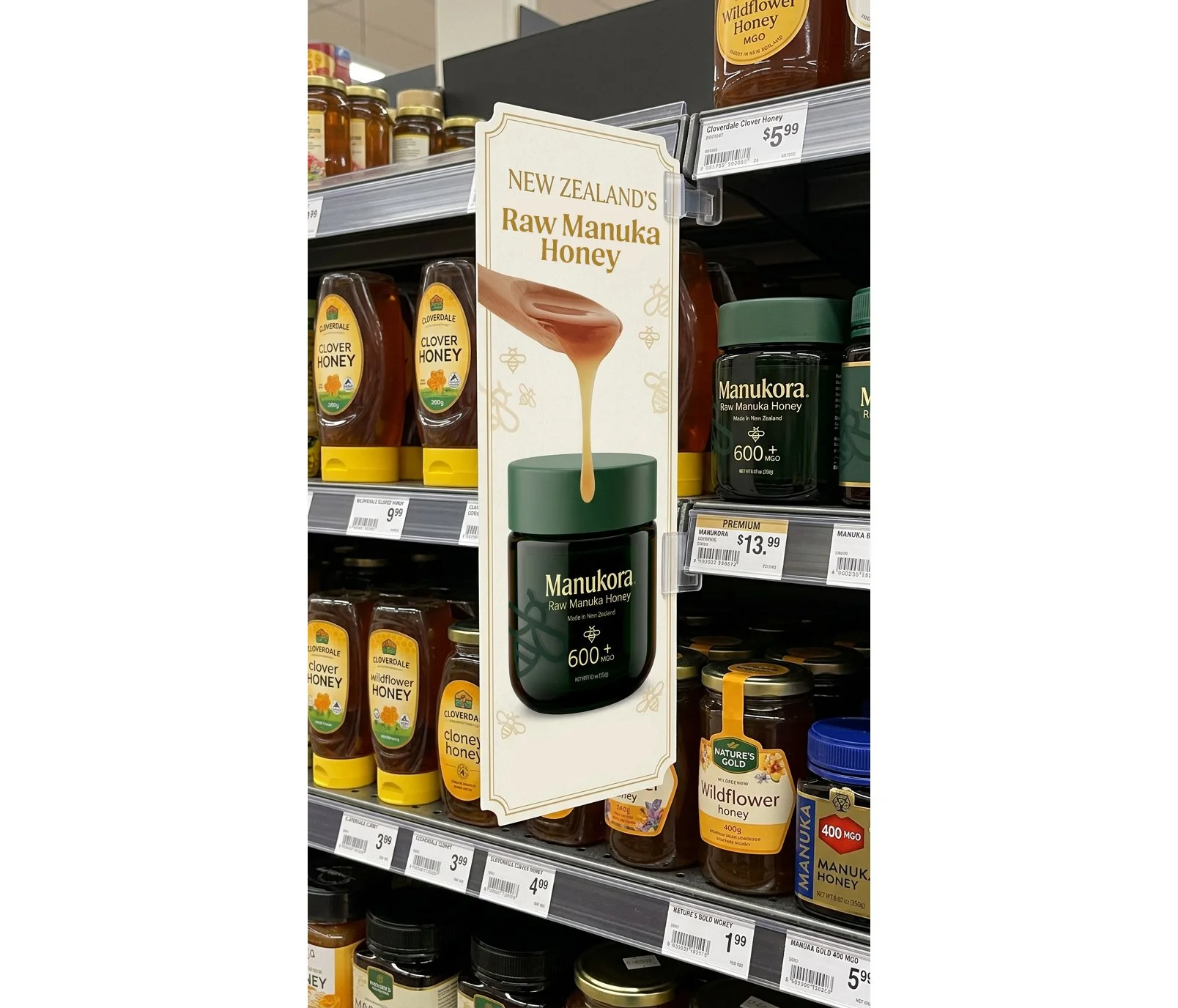
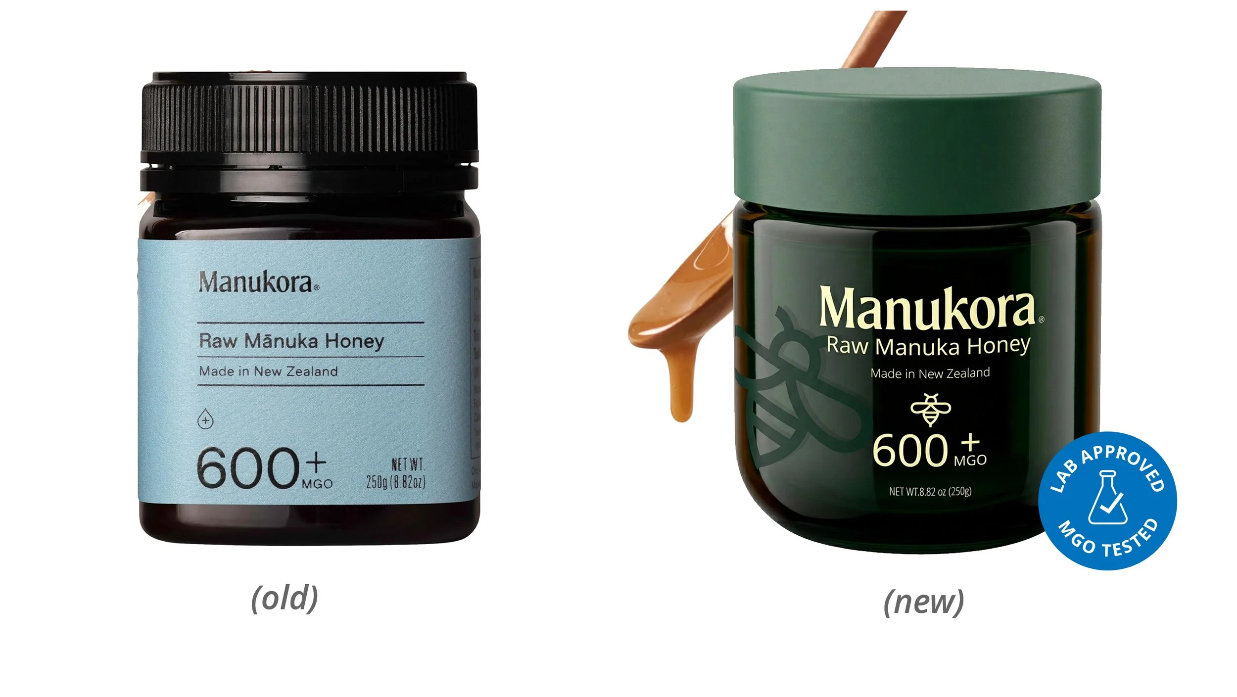
The rebrand began with packaging—the primary touchpoint in the consumer journey. I developed a refined visual identity rooted in natural cues associated with bees and honey. A new color palette was introduced to evoke nature while elevating the perception of luxury. The new hunter-green glass packaging became a key visual anchor, as well as a functional element that preserves the product’s potency by reducing light exposure. From there, I built a scalable brand system designed to translate seamlessly across multiple channels allowing the brand to perform across both digital and physical environments.
Outcome
As Creative Director, I led the development of the visual identity and designed a flexible system that could scale across marketing touchpoints while maintaining a strong, premium brand presence. The redesign positioned Manukora as a distinctive and premium player in the Manuka honey market. The new identity strengthened shelf impact, improved visual consistency across marketing channels, and created a cohesive brand experience that connects consumers to the natural origins of the product.