Business Challenge
After the breakout success of its signature Duck & Waffle dish, Samba Brands Management sought to expand into a fast-casual restaurant concept in the heart of London. Entering a saturated and highly competitive dining market, the new venture required a distinctive brand identity that could stand out visually, communicate quality, and extend beyond a single hero dish to support long-term growth.
Strategy
We developed a bold yet rustic brand system designed to reflect the handmade quality of the food while commanding attention in a crowded urban landscape.
The visual identity centered on:
A powerful red and yellow color combination to create energy and appetite appeal
Handmade-inspired typography to reinforce authenticity and craftsmanship
Added texture within the color palette to soften intensity and introduce warmth and tactility
Beyond visual branding, we identified an operational growth opportunity: restaurants traditionally peak during dinner service. To increase revenue windows, we strategically expanded the brand experience across additional dayparts and occasions.
We implemented a color-coded marketing system to clearly differentiate offerings:
Pastel Blue = Brunch
Pastel Green = Delivery
Pastel Yellow = Happy Hour
This system extended the brand while driving awareness across multiple revenue streams — brunch, delivery, and pre-dinner traffic — maximizing daily engagement.
Results
The result was a distinctive, thoughtfully executed brand identity that balanced boldness with craftsmanship. The cohesive visual and strategic system created a memorable, scalable foundation for the fast-casual concept while supporting expanded daypart growth and diversified revenue opportunities.
Challenge
Create in-store printed materials for Michelob ULTRA Pure Gold that supported the launch of a biodegradable cooler while staying consistent with Michelob ULTRA brand guidelines.
Solution
Using core brand elements, I designed an in-store display that introduced a kraft paper texture to visually signal sustainability and connect the product to the eco-friendly initiative.
Outcome
The final design maintained brand consistency while clearly communicating the product’s organic and environmentally conscious positioning at shelf.
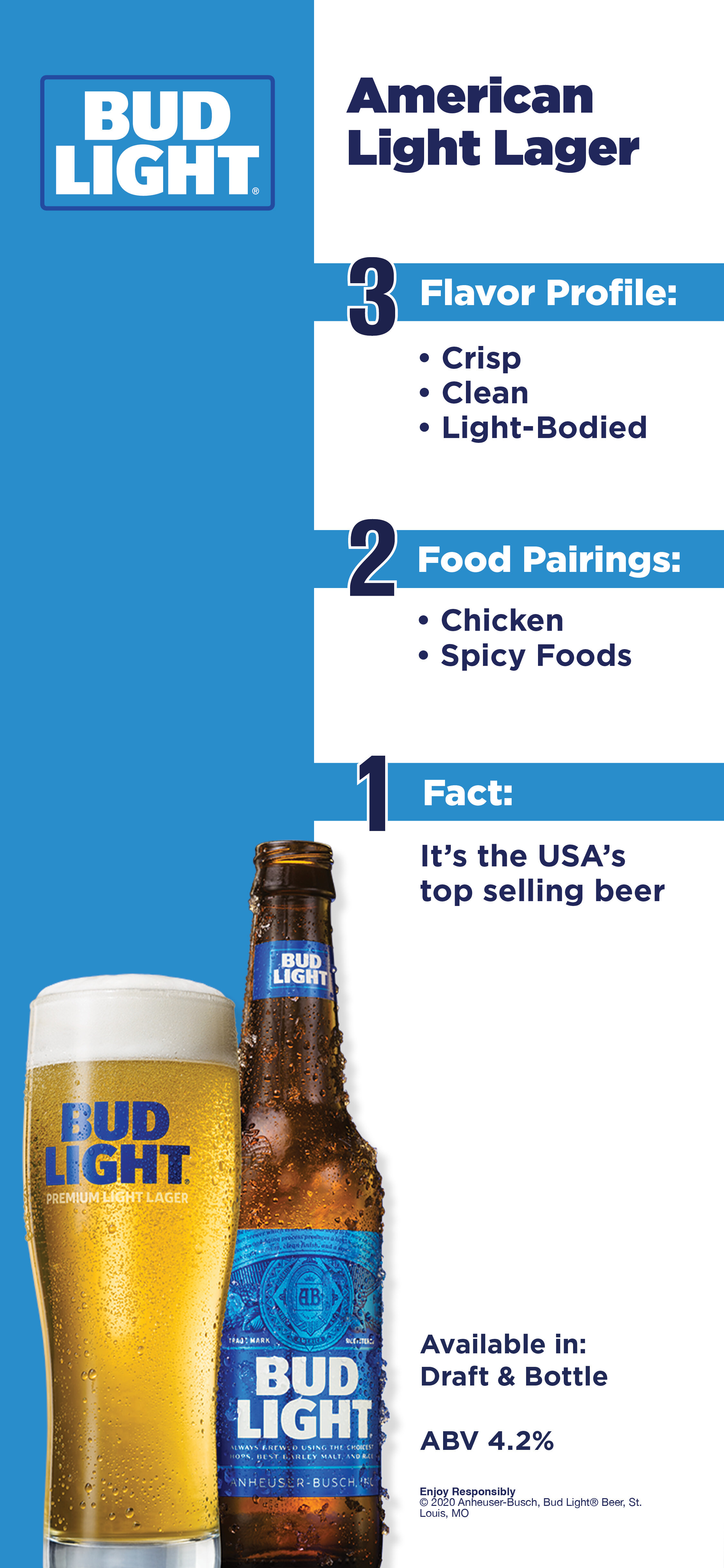
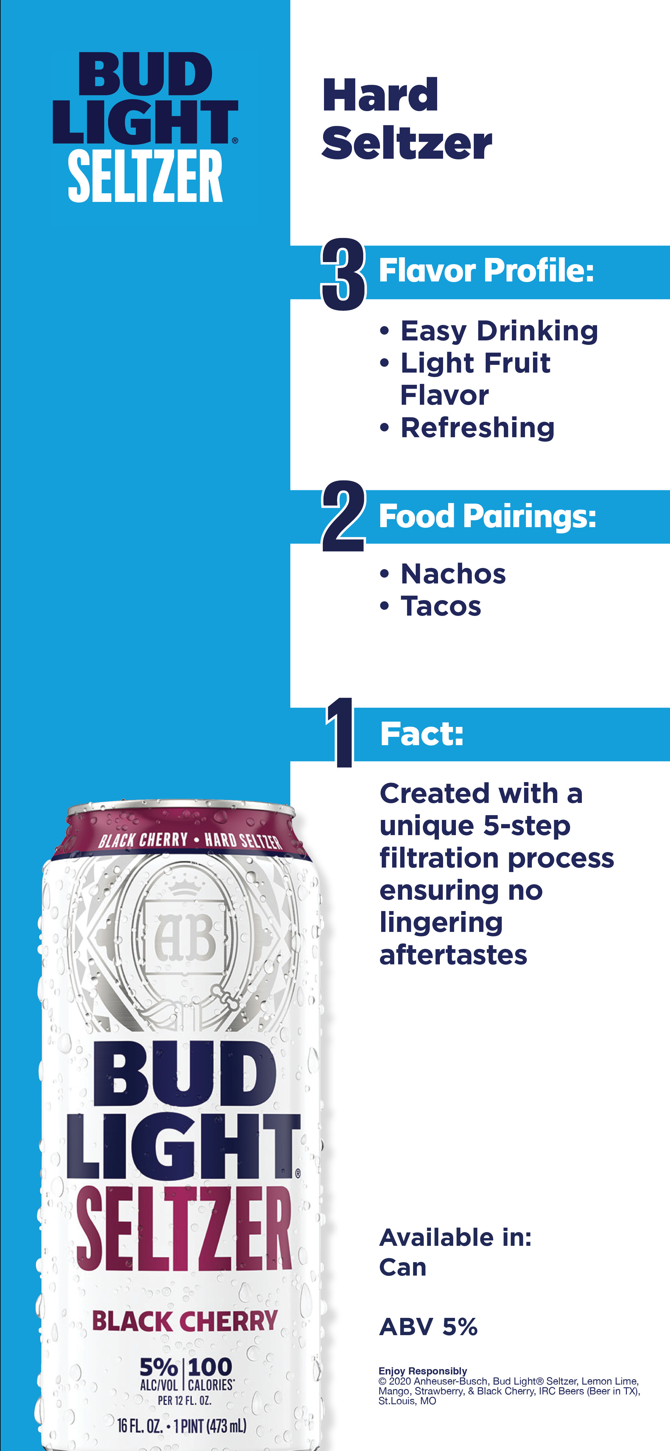
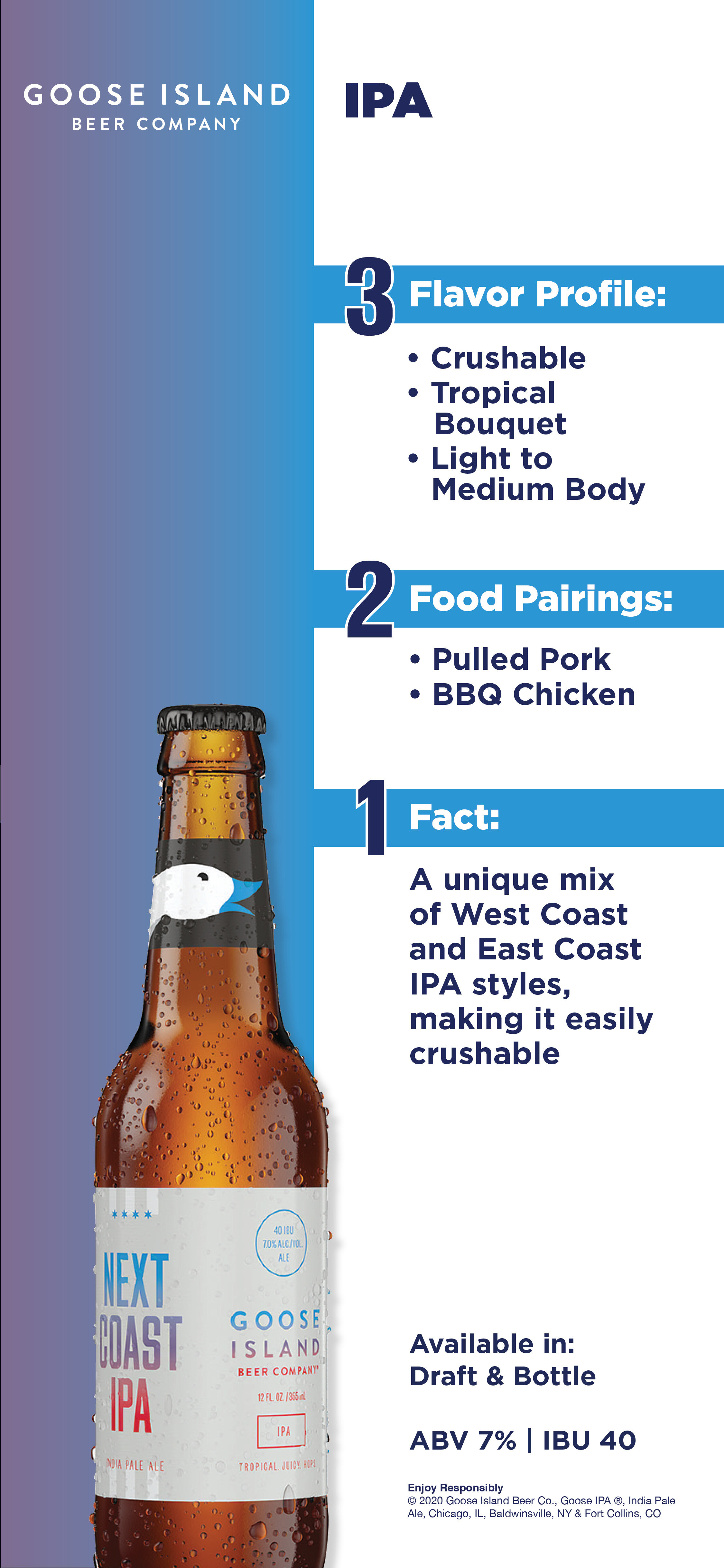
Beer Training Booklet System
Challenge
Develop a training tool for major American restaurant chains that helps server and bar staff confidently upsell beer through product knowledge.
Solution
I designed a multi-page booklet that organizes beer information into clear, digestible sections, including flavor profiles, food pairings, and key brand facts. A color-coded system allows for quick recognition, while the layout was built to scale across 30+ beers.
Outcome
The final system improved usability for staff and created a consistent, scalable framework for educating teams and supporting increased beer sales through informed recommendations.
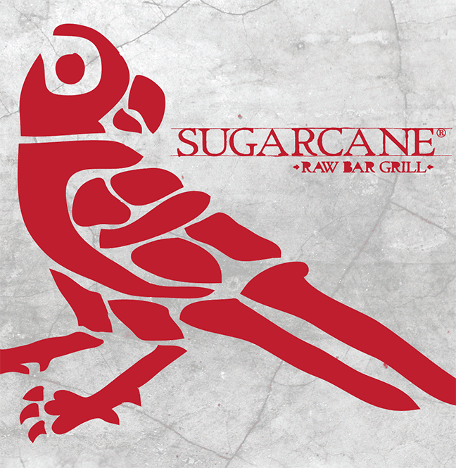
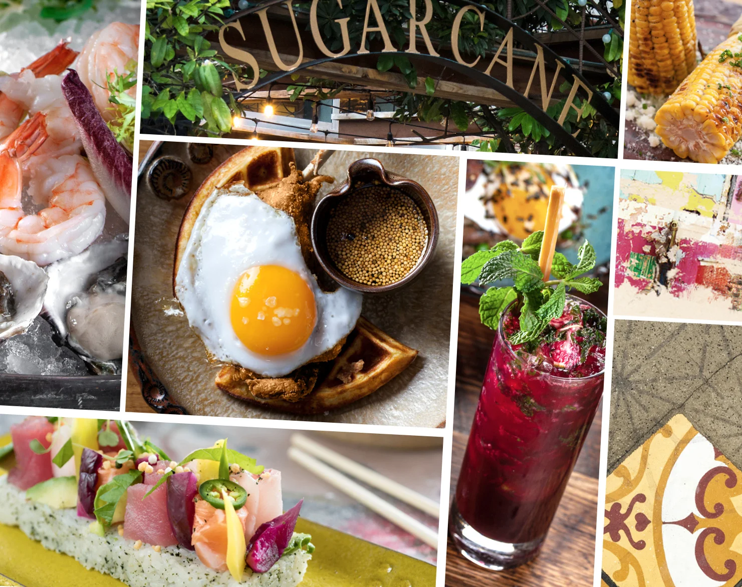
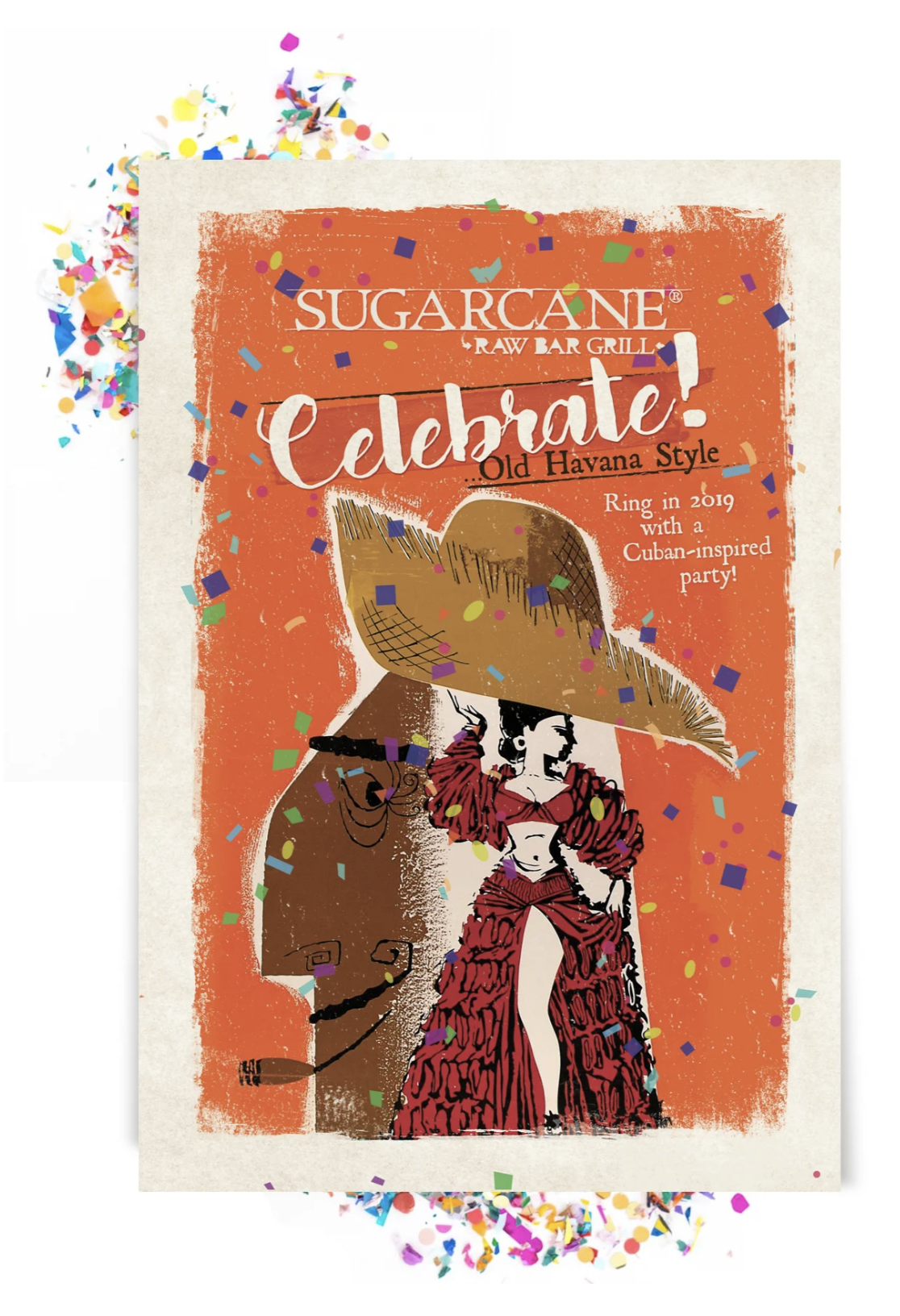
SUGARCANE Raw Bar Grill Brand Experience
Challenge
SUGARCANE Raw Bar Grill needed a cohesive brand expression that reflected its diverse culinary offering—from raw bar and sushi to open-fire grilling—while standing out in a competitive hospitality landscape.
Strategic Approach
The concept centered on “timeless eclecticism,” drawing inspiration from Old Havana and broader Latin American design. The goal was to create a rich, immersive environment that felt both authentic and contemporary, reinforcing the brand’s ethos: kick back, eat well, stay awhile.
Solution
I developed a visual and environmental direction that blended organic textures, reclaimed materials, and vintage elements with modern design. A bold red palette, layered with natural textures and handcrafted details, created a warm, energetic atmosphere across touchpoints.
The design system emphasized the restaurant’s range—visually communicating the transition from raw bar and sushi to open-fire grill—positioning variety as a key differentiator.
Outcome
The final experience unified brand, space, and storytelling into a cohesive identity that feels welcoming, distinctive, and rooted in cultural authenticity, while clearly communicating the breadth of SUGARCANE’s culinary offering.
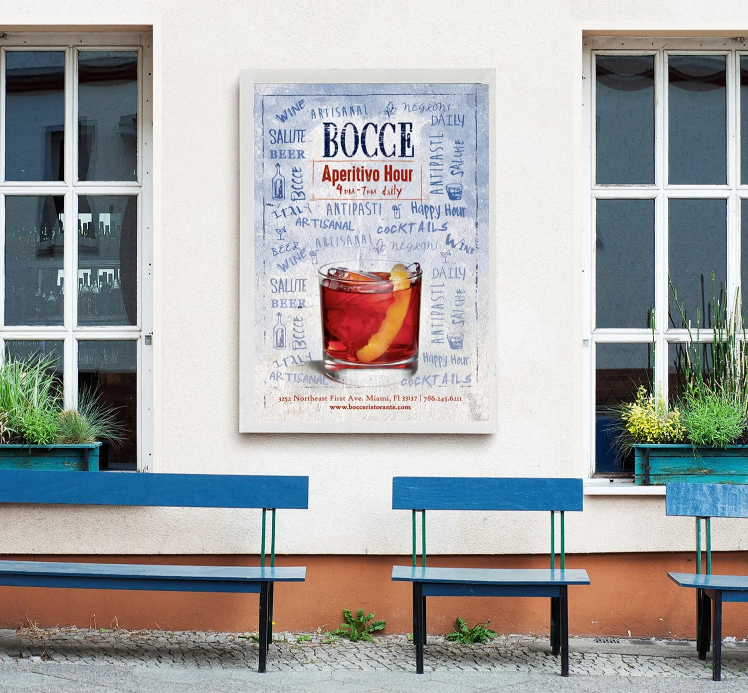
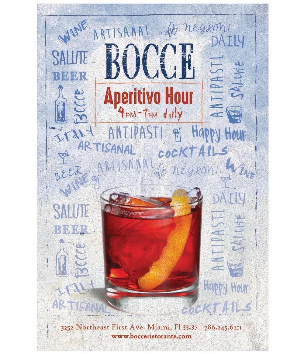
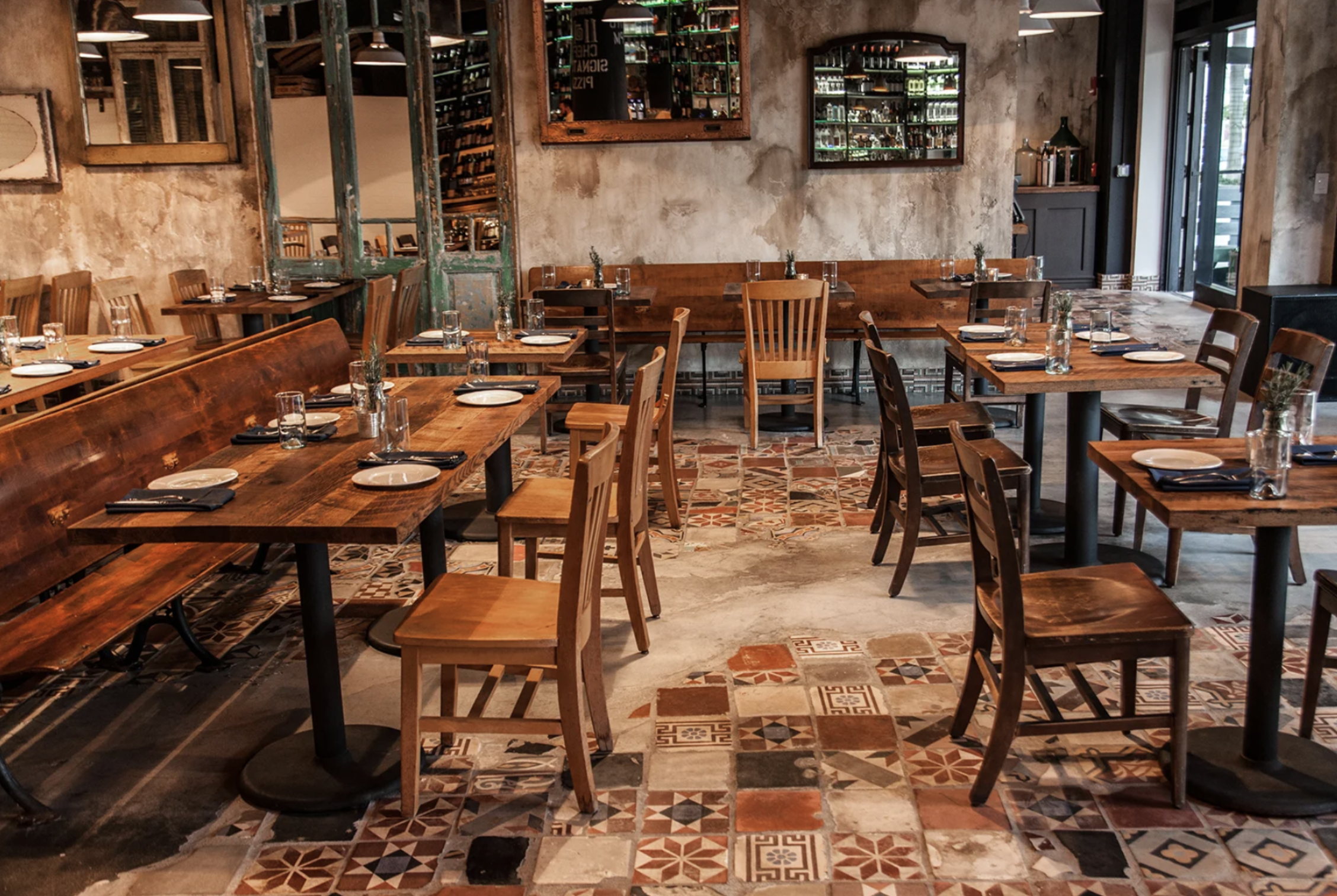
BOCCE — Restaurant Marketing System
Challenge
BOCCE needed cohesive marketing materials that reflected its authentic Italian identity while driving key revenue moments like happy hour, seasonal promotions, and dinner reservations.
Strategic Approach
The goal was to translate BOCCE’s rustic Italian atmosphere and cultural authenticity into a unified visual system that could attract guests and guide them from entry-point offers into full dining experiences.
Solution
I developed a suite of print and digital marketing assets inspired by rustic Italian design—drawing from warm textures, classic typography, and Mediterranean visual cues. Campaigns highlighted key revenue drivers such as holiday promotions and happy hour specials, designed to increase foot traffic and convert to dinner reservations.
Outcome
The final system strengthened brand consistency across channels while supporting revenue-driving initiatives. The work reinforced BOCCE’s authentic positioning—recognized by the Italy-America Chamber of Commerce—and enhanced its presence as a vibrant, culturally rooted dining destination.
keyword: bronze, vintage, Italian, authentic, holiday, christmas, tradition, animation, warmth, christmas
E-Waste Mate™ — Service Launch & Brand Expansion
Challenge
Morgen Industries, Inc. specializes in data center relocations, decommissioning, and secure electronic destruction—services that often generate large volumes of electronic waste containing valuable materials that cannot be disposed of conventionally. The opportunity was to extend the business by addressing this gap with a sustainable, revenue-generating solution.
Strategic Approach
In partnership with leadership, I identified e-waste disposal as both an environmental responsibility and a business opportunity. The goal was to create an entry-point service that could attract new clients while supporting and expanding existing offerings.
Solution
As Creative Director, I led the development and launch of E-Waste Mate™, a complementary service focused on responsible electronic waste disposal. I oversaw the branding and go-to-market materials, ensuring consistency across all marketing touchpoints while maintaining a clear, credible, and professional visual system as well as properly securing the trademarked name.
Outcome
E-Waste Mate™ successfully expanded the company’s service offering, generating a 14% increase in revenue within the first year! It also functioned as a gateway service, driving new business opportunities and strengthening the overall sales pipeline, while reinforcing the brand’s commitment to sustainability and innovation.
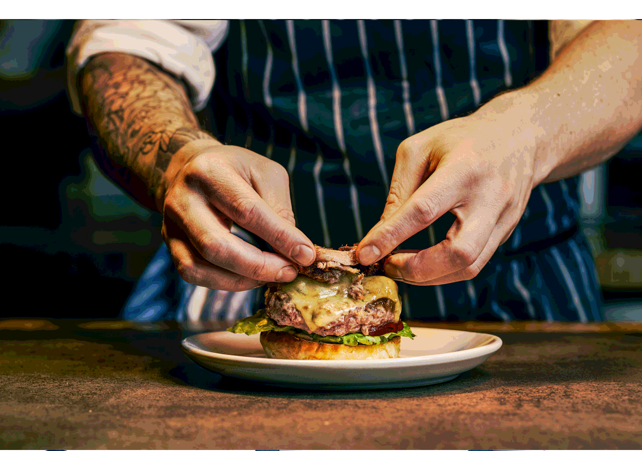
Nature at New Heights — Experiential Collaboration
Challenge
Create a cohesive visual expression for a one-day, sold-out collaboration between Petersham Nurseries and Duck & Waffle, transforming a high-rise dining space into an immersive garden experience.
Strategic Approach
The design needed to merge two distinct brand identities while reflecting the event’s central concept—an elevated, nature-driven escape inspired by Petersham’s celebration of the natural world.
Solution
I developed a suite of custom printed materials that blended both brands through refined co-branding. The Duck & Waffle seal was softened with foliage details to visually align with the garden concept, while the overall system mirrored the lush, plant-filled environment installed in the space. I also help bring this vision to life by art directing the photoshoot for the custom marketing pieces.
Outcome
The final design extended the physical experience into a cohesive visual story, reinforcing the partnership and contributing to a fully immersive, sold-out event.
tiaraconcepts@yahoo.com | 973.769.7534